As the product designer, I focused on:
UX strategy: Mapping flows, reducing friction in resident and admin tasks
UI design: Creating clean, consistent interfaces across the ecosystem
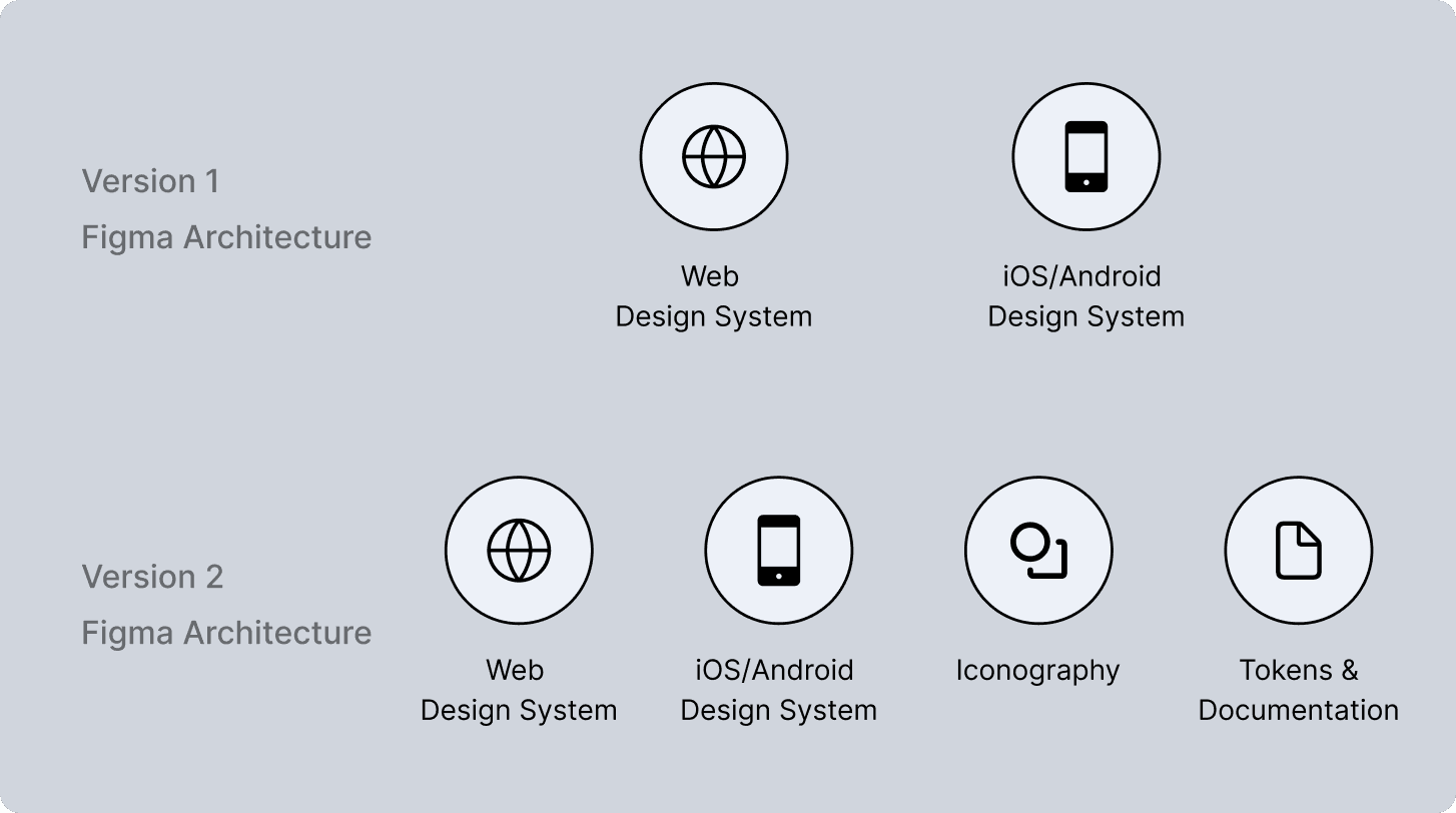
Design systems: Establishing design tokens, reusable components and handoff-ready specs
I collaborated daily with PMs, engineers, and operations to ensure design decisions were feasible, testable and scalable.
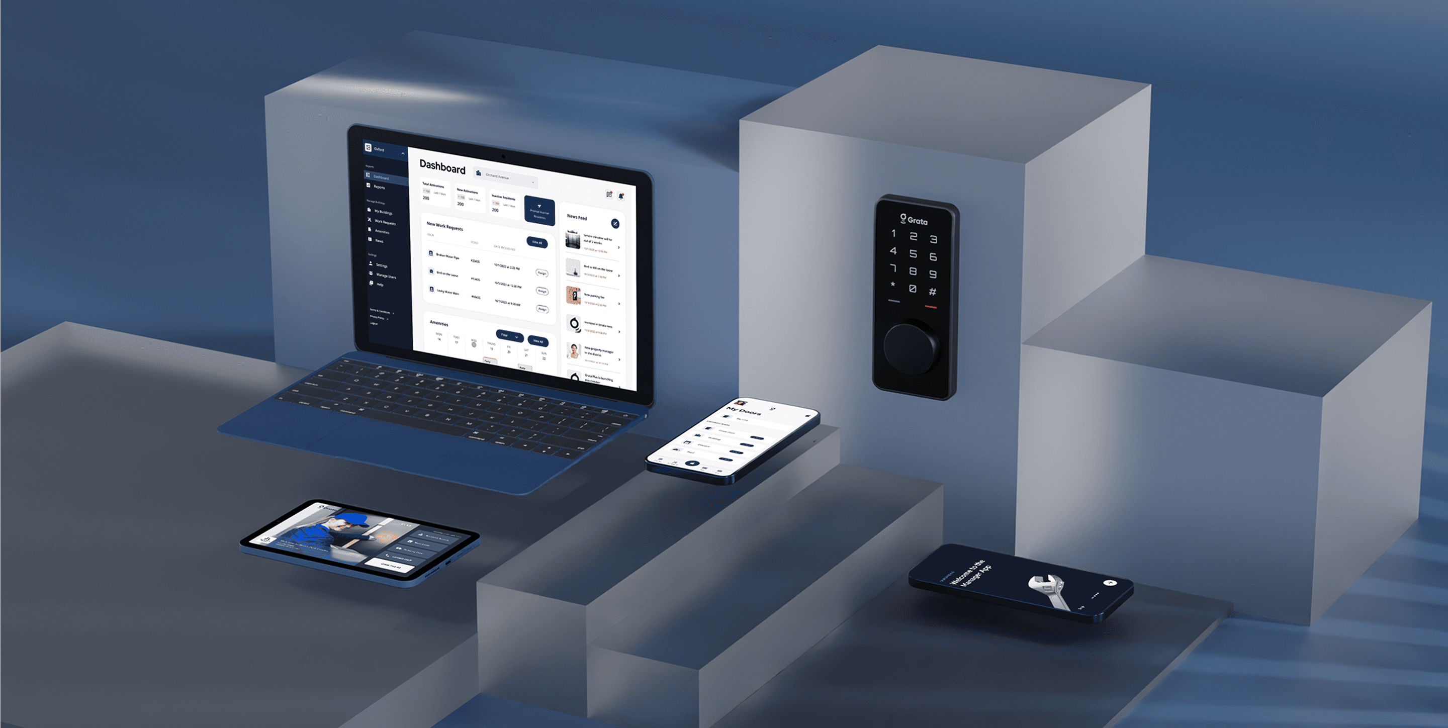
We kicked off with an audit and user research across our 3 core MVP products: Resident App, Manager App, and Admin Portal.
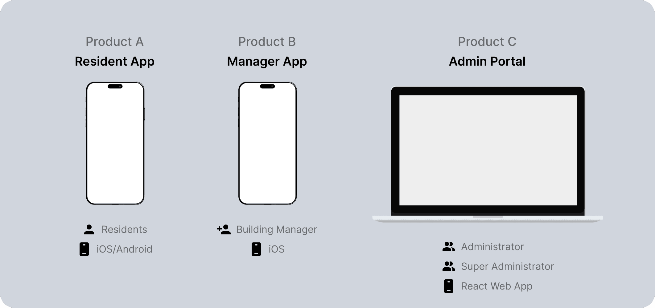
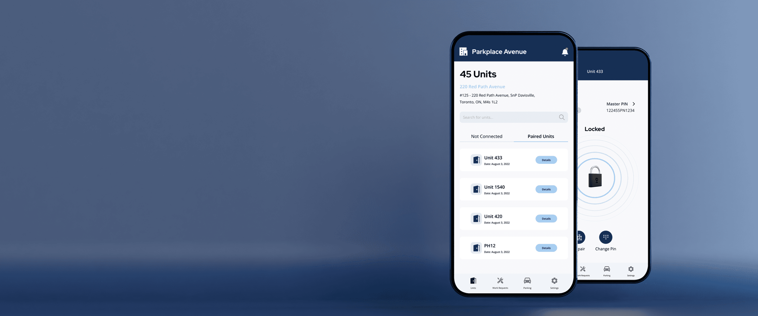
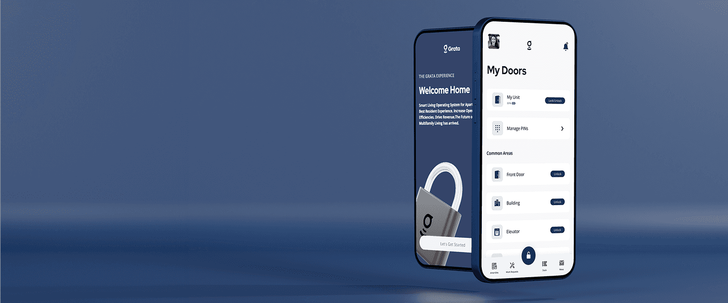
Resident App
Features
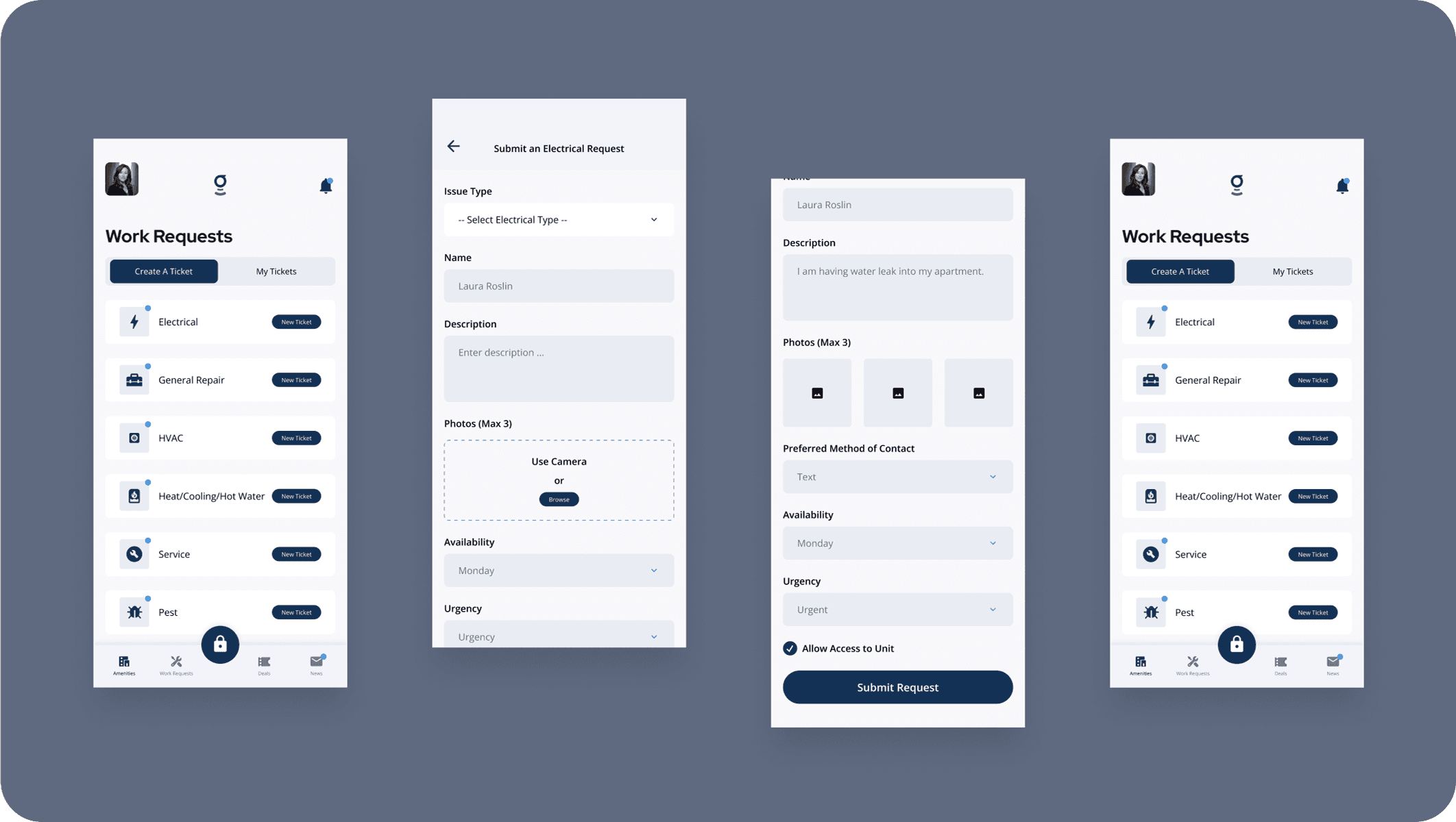
Digital Key, Work Requests, Amenity Booking, News
User Types
Residents who are the end users
Manager App
Features
Manage Work Requests, Setup Locks (Digital Keys)
User Types
Building Managers who are on-site or remote property staff managing daily operations
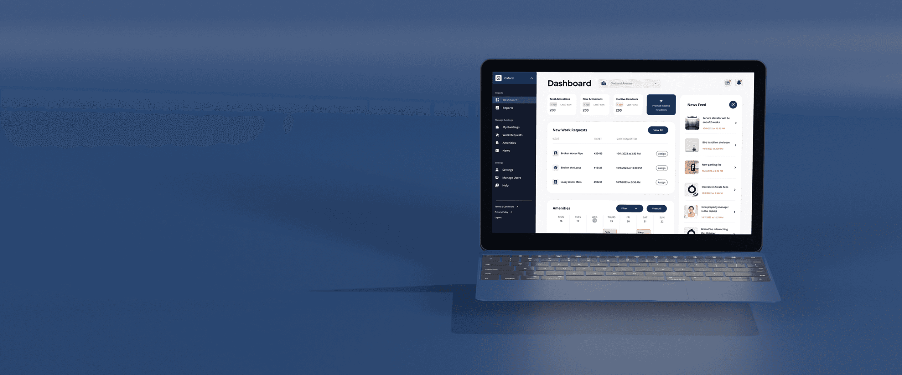
Admin Portal
Features
Manage Work Requests, Manage Requests, Manage Amenities, Create News, Track Usage Data
User Types
Admins who are high-level operator managing multiple organizations
Findings
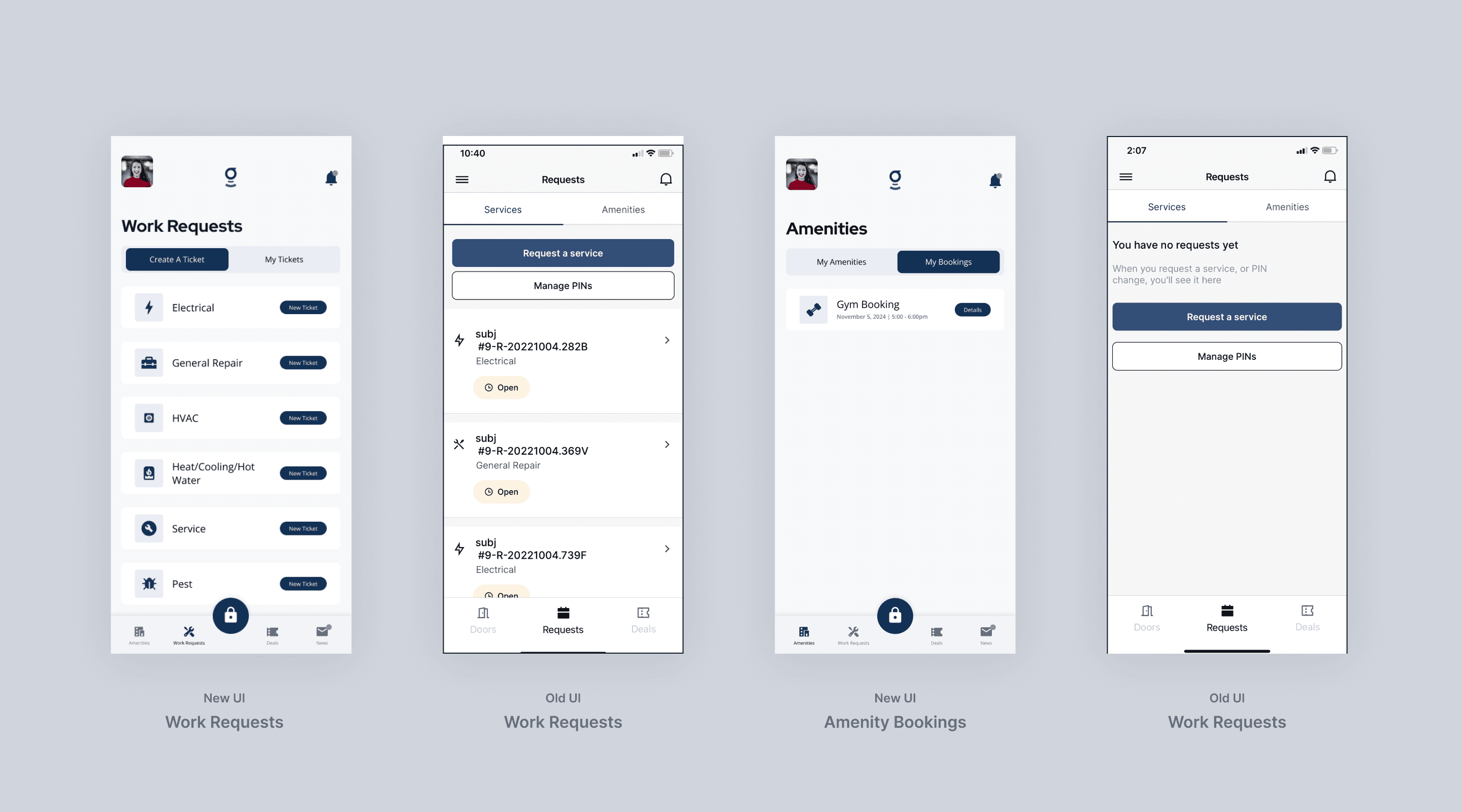
Amenity Booking is Difficult
Residents reported that the process to book amenities felt confusing and unintuitive, often requiring multiple unnecessary steps.
Too Many Touchpoints
Core actions (like submitting requests or accessing building features) required too many screens or taps, leading to frustration and drop-off.
Lack of Effective Notifications
Important updates—like booking confirmations or service responses—were either delayed, unclear, or completely missed due to insufficient notification logic.
Dated Visual Design
The current UI felt visually outdated, making the app feel less trustworthy or polished compared to modern consumer apps.
Findings
Inconsistent App Experience
Experience between the Manager App and Admin Portal felt disjointed and had inconsistent patterns
Poor Comms with Residents
Managers struggled to keep residents informed—there was no clear way to confirm updates or track follow-ups on requests.
Too Many Touchpoints
Key workflows like resolving work requests or amenities required too many steps.
Modify Functionality
Creating, editing and updating submitted work requests or amenity bookings was awkward and difficult.
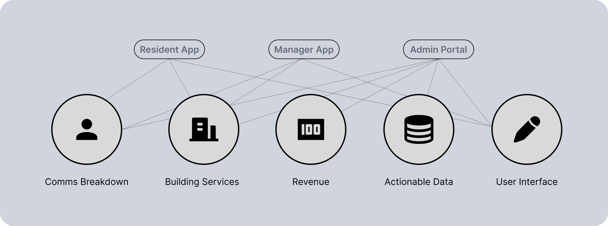
Inconsistent UI
Visual styles and component behaviors were inconsistent across platforms, impacting trust and usability.
Communication Breakdown
Residents missed key updates and lacked real-time visibility. Building managers also had no reliable way to confirm or track communication.
Weak Building Services
Work requests, payments, and bookings were split across disconnected, unintuitive flows.
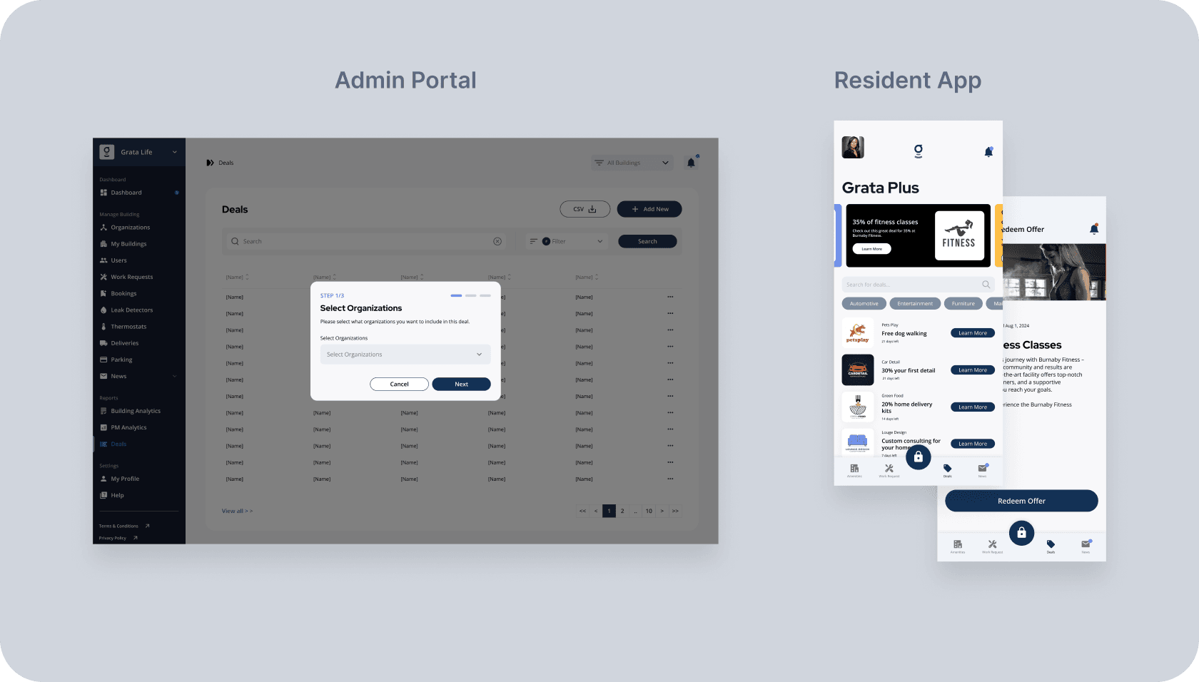
Missed Revenue Opportunities
There was no structured system for promoting sponsored content or resident-facing offers.
Weak Admin Insights
Admins could access basic metrics but lacked actionable insights or trend forecasting.
Research revealed missed revenue opportunities—there was no structured way to surface sponsored content or resident-facing offers within the app.
Comms Breakdown
We upgraded Grata’s basic News system into a dynamic, role-based messaging tool with custom push types, badge alerts and engagement tracking.
MVP
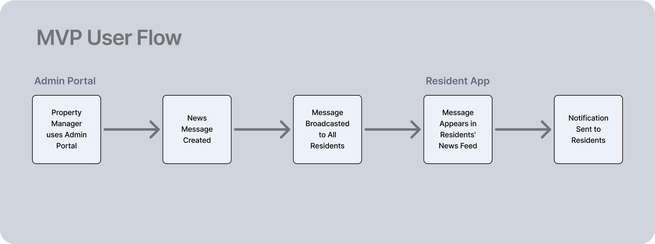
In the original version of the messageing system, property managers could create and send News items through the admin portal. However, these messages were globally broadcast to all residents, with no ability to target specific roles or user types.
On the resident side, the News section functioned as a basic, static message feed. Messages appeared as simple timestamped entries, with no ability to filter, search, or interact.
New Features
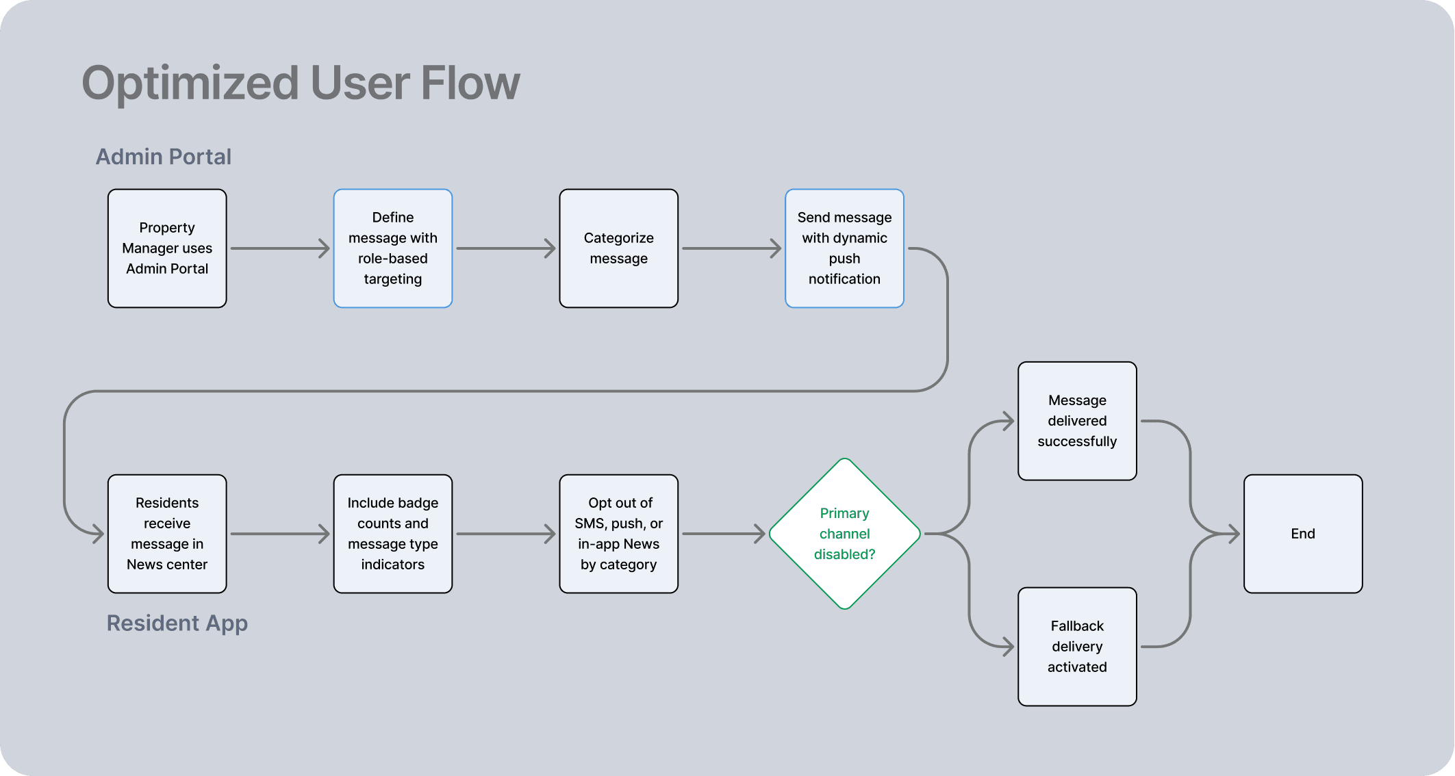
Role-Based Messaging
A major improvement was the ability to target News messages by user role and audience. Admins could now send updates to specific residents based on unit, building, or user type.
Dynamic Push Notifications
We introduced type-based push notifications, allowing admins to tag messages as Warning, Info, Success, or Default. Each message type came with a distinct visual style, icon, and tone, both in the push notification and within the app interface.
Engagement Rates (Admin Portal)
Finally, we built out a backend layer that allowed admins and property managers to track message performance.
Testing
We conducted in-house A/B testing along with targeted questionnaires for both residents and property managers (PMs).
Resident Feedback -
Learned that the volume of notifications—especially redundant or low-priority ones—was a major source of annoyance. In response, we introduced opt-out controls for SMS, push notifications and in-app News.
PMs -
he process of creating and sending News messages involved too many steps and touchpoints, making it inefficient for day-to-day us. (this has not been fully explored due to bandwidth.)
V2
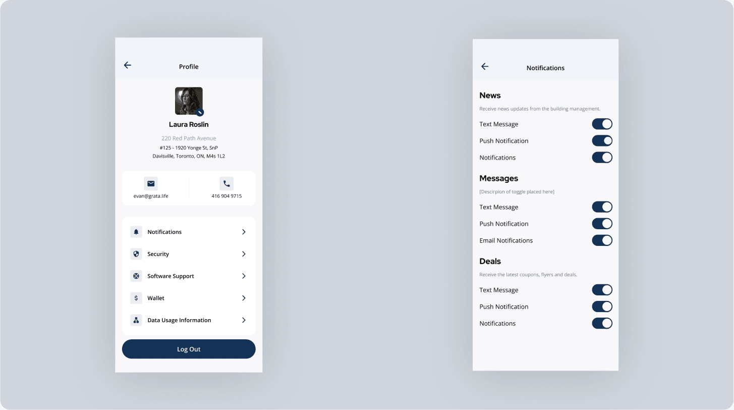
Opt-Out Notifications
We introduced a notification preferences system. Users can now opt in or out of communications via SMS, push notifications, and in-app news, based on their personal preferences and the type of content.
We secured two major white-label clients this year— with an extra 15 000 users using the white-labeled Resident App. This was driven by a more cohesive ecosystem, unified design system, and streamlined workflows.
Development time for new features decreased by 30% and development time for white-labeling decreased by 150%.
By transforming awkward MVPs into a cohesive, role-based platform, we not only improved usability for residents and building teams, but also created a scalable foundation that supported rapid product development with shorter development times.
The redesigned Marketplace—initially underperforming—was relaunched with clearer structure and better categorization. In the weeks following launch, engagement improved with a 35% increase in resident interactions and a 40% uplift in CTR, turning a low-traffic feature into a steadily growing channel for in-app value.