Muve-It

Muve-It

Muve-It

Muve-It is a delivery platform connecting customers with local drivers for large-item moves. The original mobile app was built as a minimum viable product (MVP) with core delivery functionality but lacked structure, scalability and design in its UX/UI.

Muve-It is a delivery platform connecting customers with local drivers for large-item moves. The original mobile app was built as a minimum viable product (MVP) with core delivery functionality but lacked structure, scalability and design in its UX/UI.

Client

Muve-It

Role

Product Designer

Date

May 2023 - 2024

Preview

muve-it.com

My Role

As the product designer, I focused on:

UX Strategy
Streamlining resident and admin workflows by mapping user flows and reducing friction in key tasks.

UI Design
Designing clean, consistent interfaces that improved usability and aligned with platform guidelines.

Design System
Rebuilding the component library to be scalable and modern, with reusable components and developer-ready specs.

Audit/Research

Audit/Research

Audit/Research

Problem/Solution

No Research Sprint We were working under tight timelines, and the client expected quick results. There wasn’t enough room for a full research sprint, which led to a few early features missing the mark and some scope creep mid-sprint. This caused avoidable rework and slowed overall progress. Our Dynamic Approach We focused on speed and clarity. Using lightweight validation methods and fast prototyping, we were able to test ideas early and keep development moving. I translated client requests into clear features using user stories and helped keep design, development, and business aligned to avoid delays and scope drift - which was a constant struggle.

Research Solutions

We adopted a lean, iterative process that prioritized deliverables and quick feedback. With no budget for a formal research sprint, we used free testing tools to validate designs early and often.

Competitive Analysis

Study direct and indirect competitors.

Competitive Analysis

Study direct and indirect competitors.

Competitive Analysis

Study direct and indirect competitors.

Review Mining

App Store and Google Play reviews of competitor apps.

Review Mining

App Store and Google Play reviews of competitor apps.

Review Mining

App Store and Google Play reviews of competitor apps.

In Agency A/B Testing

No time or budget for formal research sprints.

In Agency A/B Testing

No time or budget for formal research sprints.

In Agency A/B Testing

No time or budget for formal research sprints.

Summary

1. Multiple UX Issues The MVP had several foundational UX problems, including unclear button labels and no visual hierarchy—making basic interactions confusing for users. 2. Inconsistent UI We inherited an outdated and inconsistent component system that lacked visual alignment, forcing us to rebuild the UI to meet modern usability standards. 3. Limited User Control There were no undo options, and users frequently hit dead ends with no clear way to go back or adjust inputs—creating frustration and drop-off. 4. High Cognitive Load Important details didn’t persist between screens, requiring users to memorize information and increasing the risk of error. 5. No Onboarding or Guidance The app launched users into core flows with no onboarding, tooltips, or recovery messaging—leaving many unsure how to proceed when things didn’t work.

Competitive Analysis

Competitive Analysis

Competitive Analysis

Feature

Uber

Lyft

Muve-it

Real Time Tracking

Yes

Yes

Yes

Onboarding

Yes

Yes

Yes

Driver Journey

Yes

Yes

Yes

Customer Journey

Yes

Yes

Yes

Support Chat

Yes

Yes

Planned

Multi-stop Routing

Yes

Yes

Planned

Uber & Lyft Strengths

Real-Time Feedback: Immediate status updates with live tracking, driver ETAs, and delivery states. Progressive Disclosure: Information is shown only when needed—reducing clutter and mental load. Efficient Onboarding: Smart use of autofill, ID scanning, and pre-validation. Clear Job Lifecycle: Clear status transitions—"Available Jobs," "In Progress," "Completed." Customer Trust Signals: Prominent display of driver photo, vehicle, license plate, and ratings.

Differences

While Uber and Lyft are designed for quick, individual rides, Muve It is purpose-built for logistics — including moving services, deliveries, and heavy transport. This fundamental difference shaped both the product strategy and the UX approach.


Team-Based vs. Solo Driver
Unlike rideshare apps that pair one driver with one rider, Muve It coordinates teams of movers or drivers per job. This required unique flows for assigning teams, managing multi-person tasks, and tracking each participant in real time.


Scheduled Jobs vs. On-Demand Trips
Muve It supports scheduled, multi-hour jobs with location-specific timing — far more complex than the rapid pickup/drop-off model Uber and Lyft are optimized for.

Admin & Dispatcher Roles
While Uber and Lyft focus on consumers and drivers, Muve It includes robust admin and dispatcher tools to manage bookings, track operations, and adjust availability across service regions.


Custom Pricing Logic
With regional pricing, job-based quotes, and variable service types, Muve It required custom logic and pricing flows that go beyond standard rideshare app structures.

Complex Flows Require More UX Support
The added complexity of logistics meant the UX needed to offer clearer guidance, including persistent job summaries, real-time status updates, and built-in customer support entry points.

New User Flows

New User Flows

New User Flows

Onboarding - Driver & Customer Flows

Mobile App

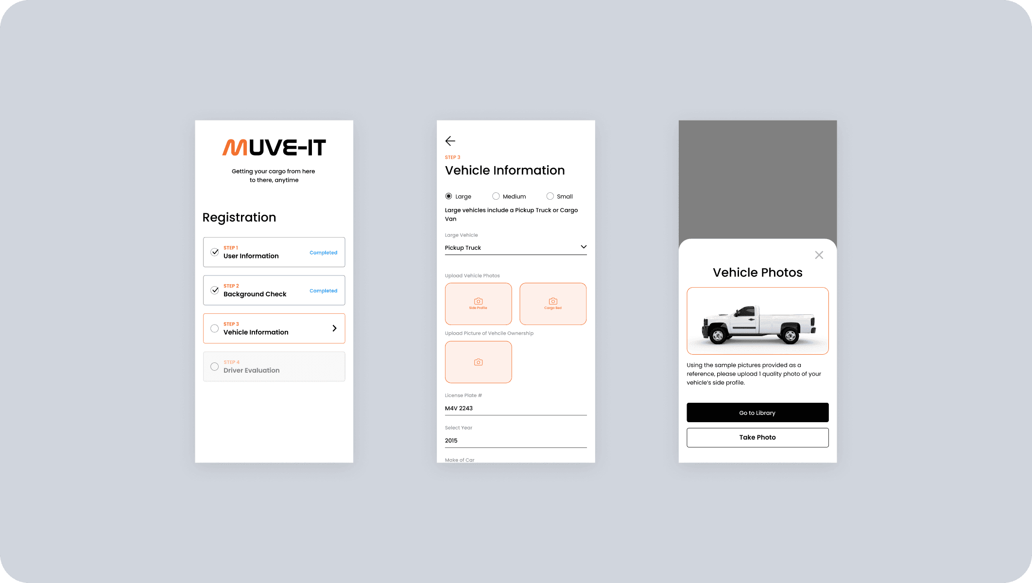
We designed tailored onboarding flows for both customers and drivers. While the customer flow prioritized speed and simplicity, the driver onboarding required multi-step verification, including ID upload, vehicle details, insurance proof and background check.

Service Call Scheduling

Mobile App

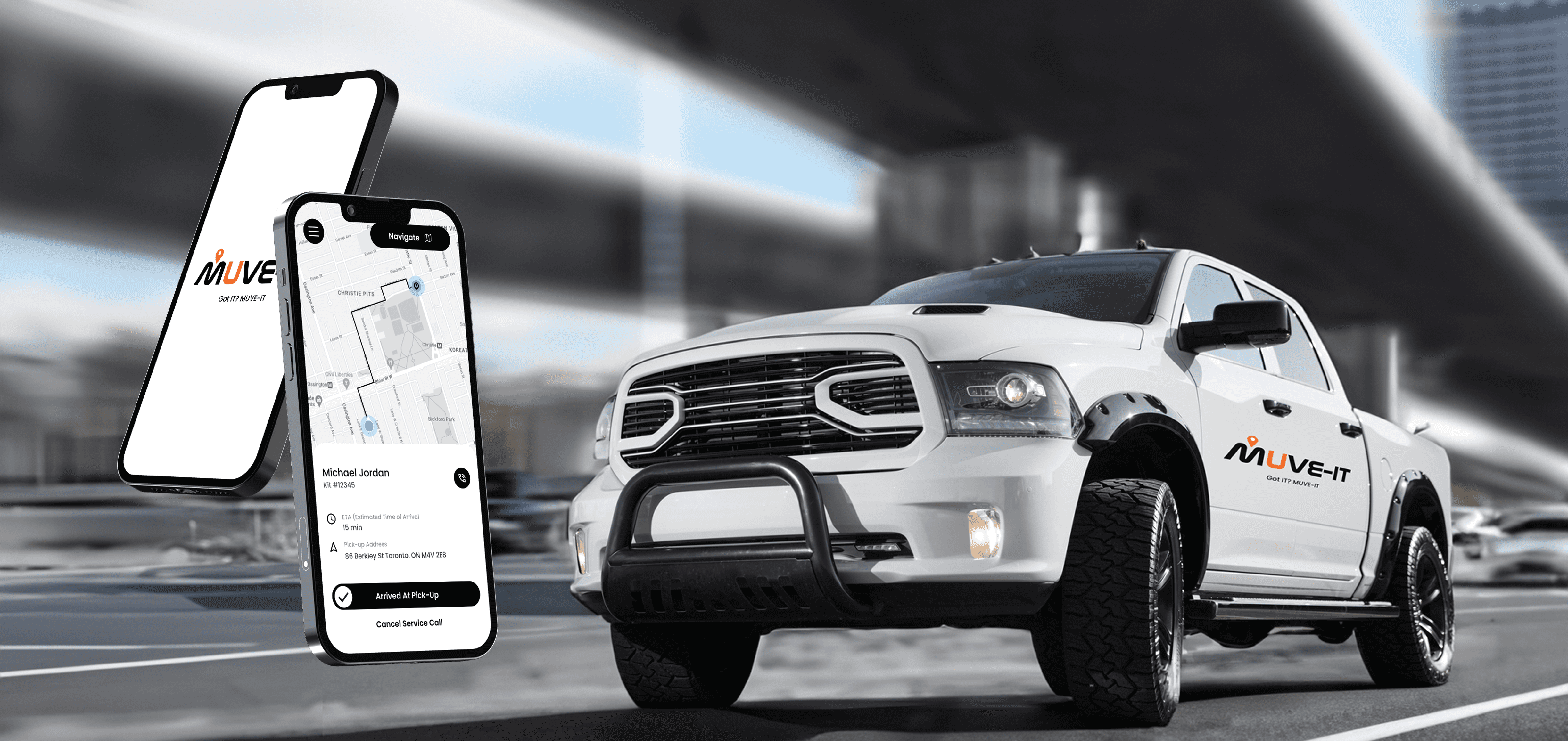
Users can clearly define item types and pickup/drop-off locations, with a real-time pricing estimator, ETA and interactive map that includes route previews.

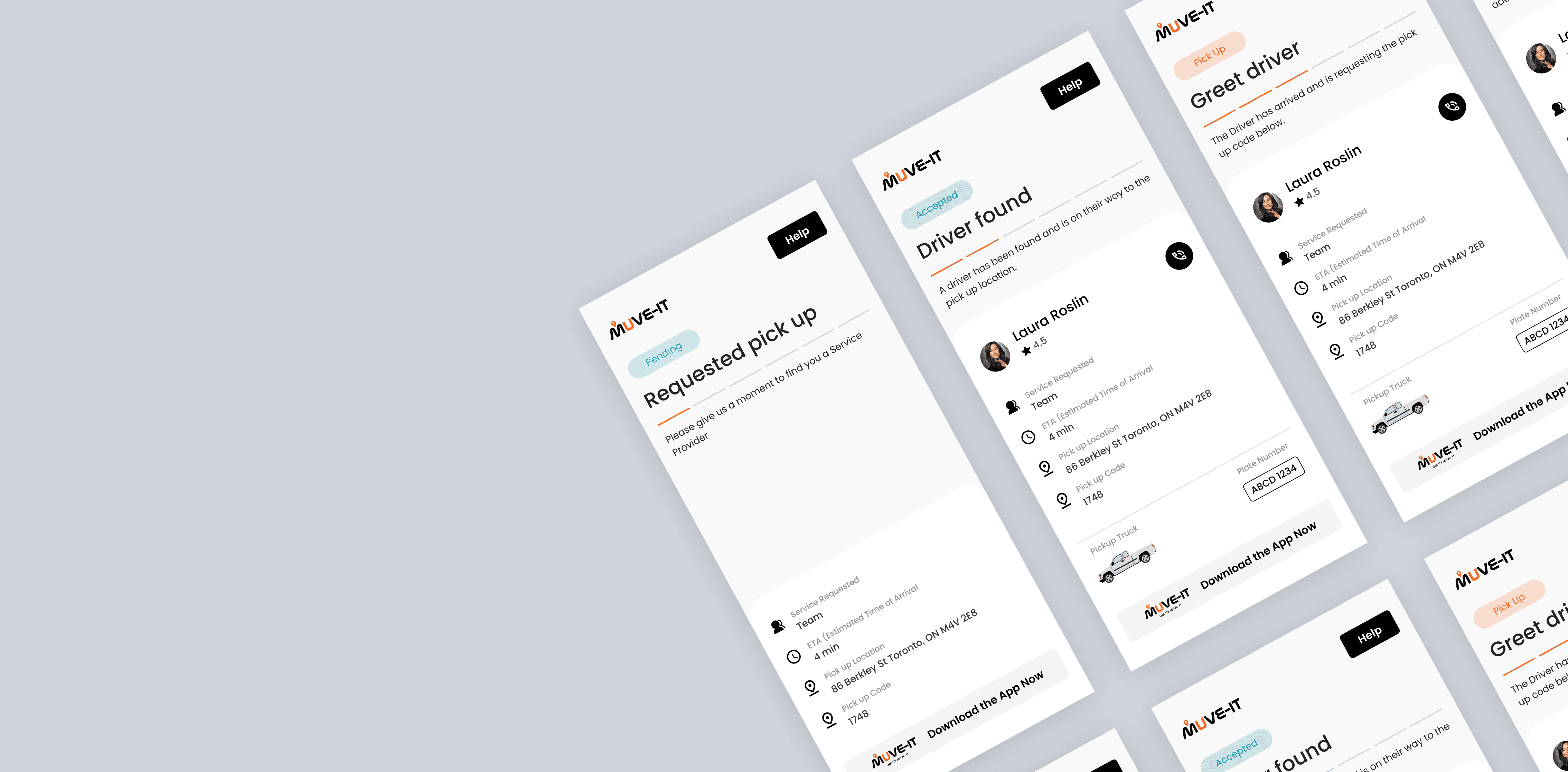
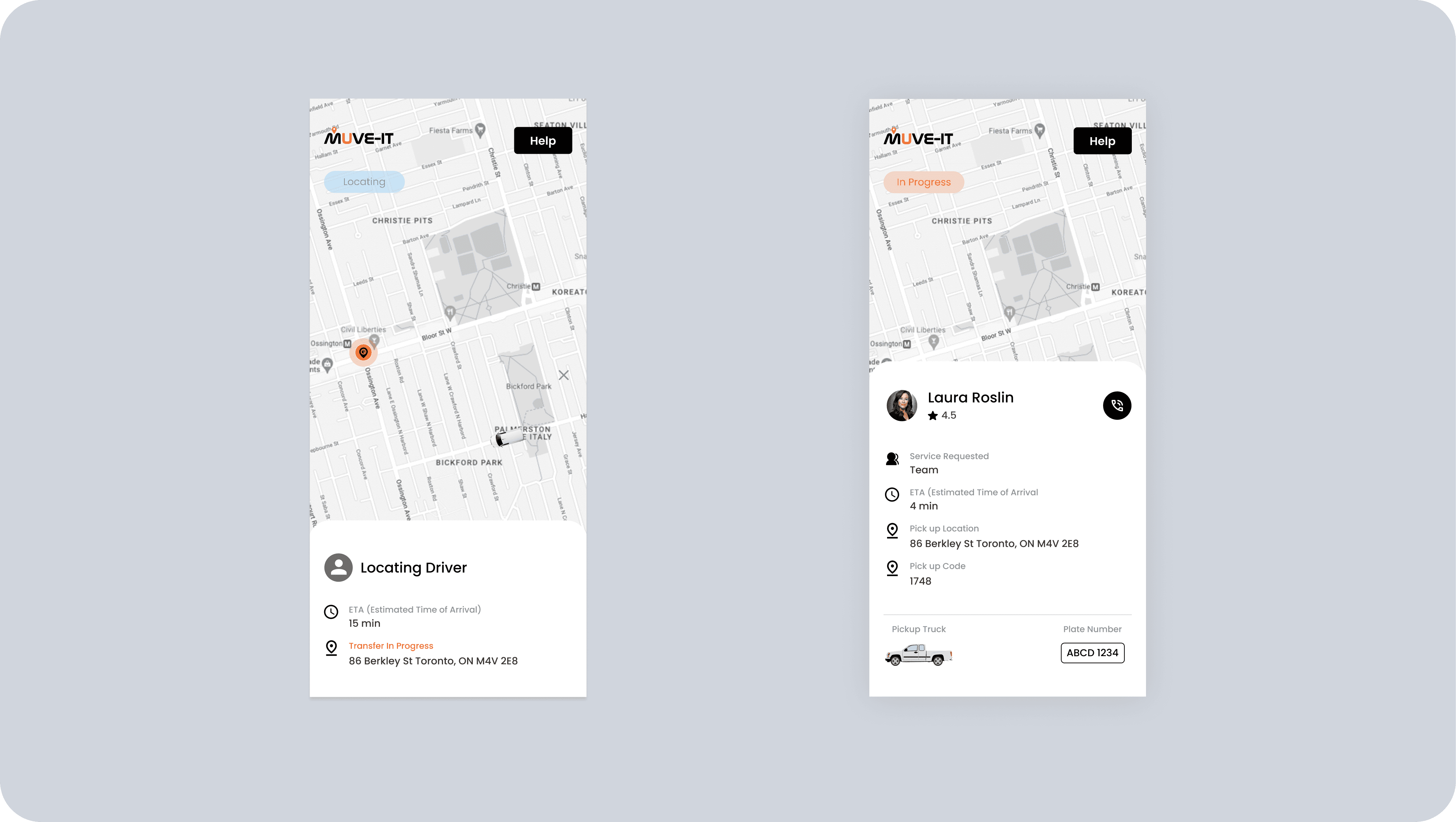
Live Tracking + Notifications

Mobile App

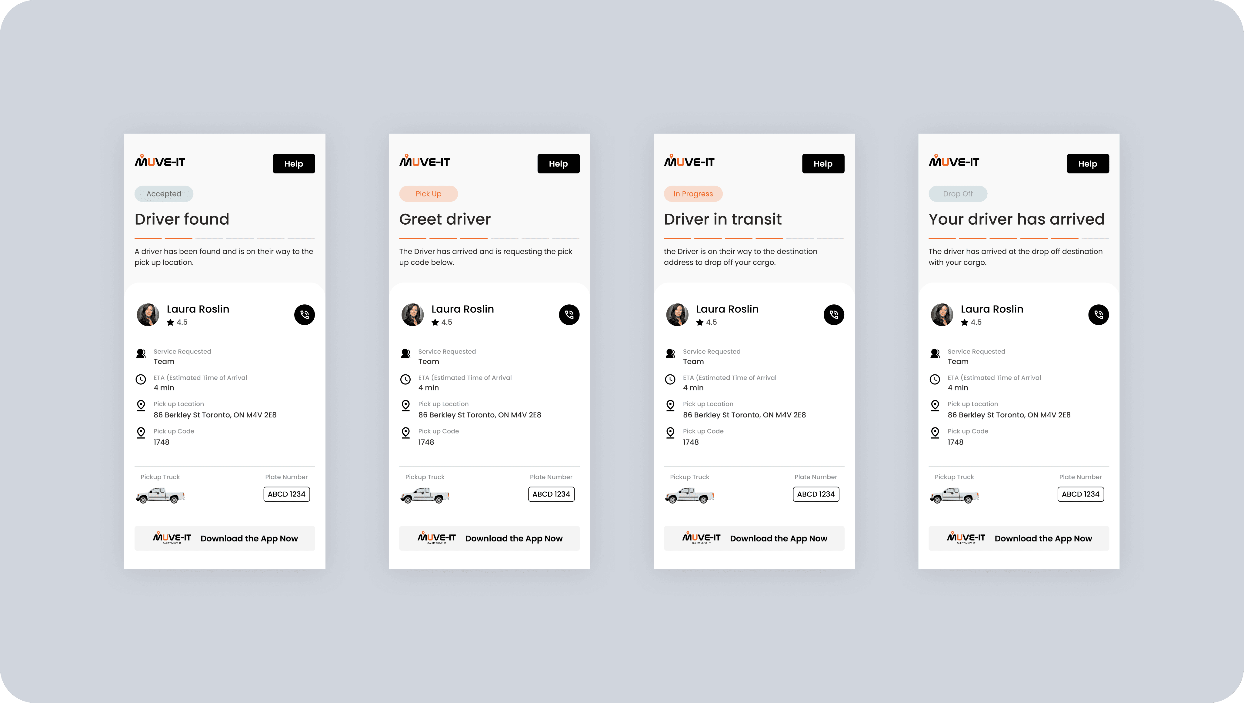
Once a job is scheduled, users receive live driver tracking, ETA updates, and contextual notifications—like when the driver is en route, nearby or the delivery is complete.

Feedback & Completion

Mobile App

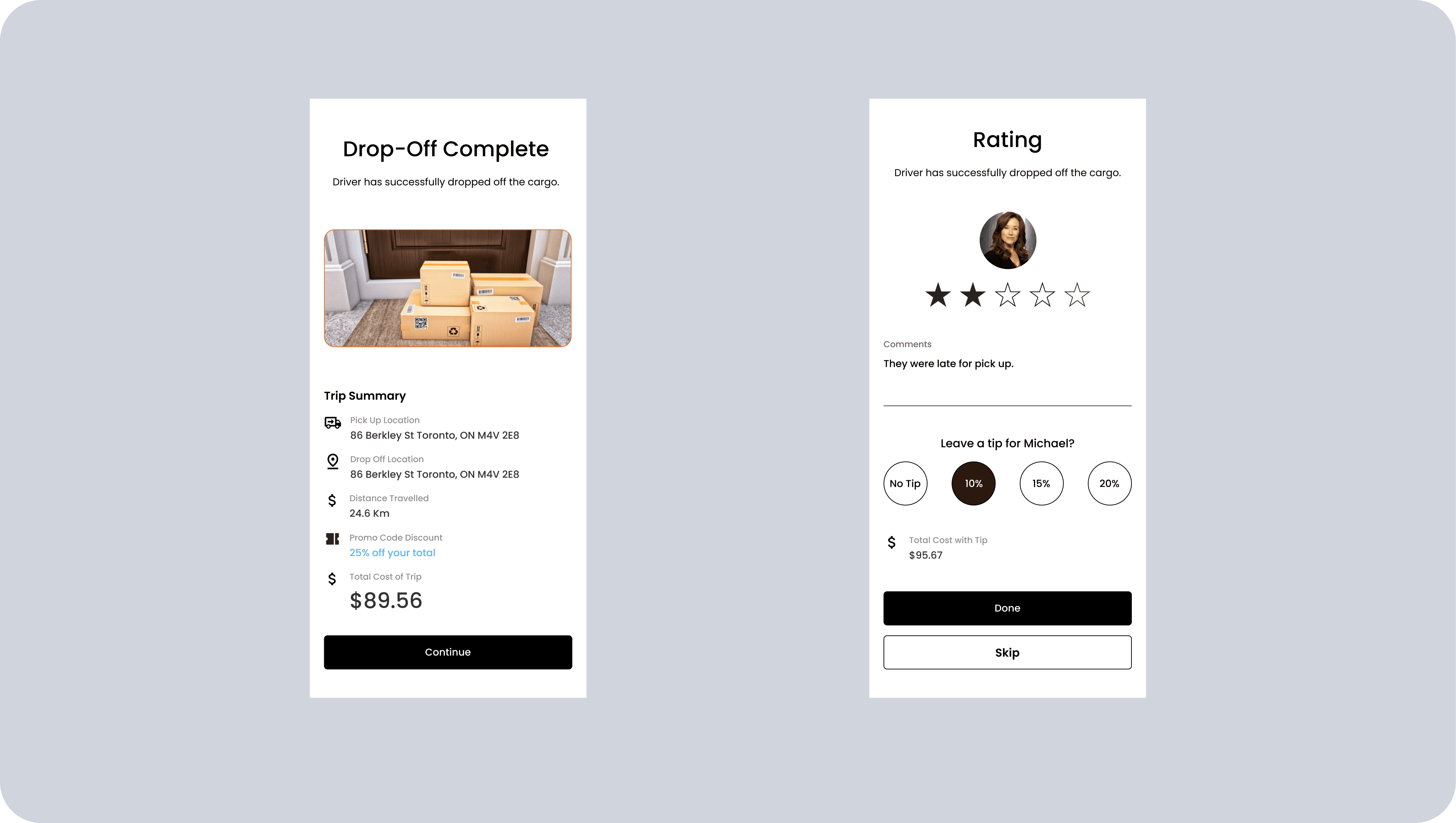
After service, users receive a confirmation summary with delivery photo and signature. They can tip, leave a rating and rebook with one tap in history settings..

Future Systems

Future Systems

Future Systems

Our 3-Step Process for Scalable UX – Muve It

1. Variable UX Flow Framework We introduced a flexible UX structure that accounts for different future states of the product. This allowed the team to move forward confidently with a clear primary flow, while also documenting alternate user journeys that could be activated or adjusted later without reworking the core system. 2. Purpose-Built Design System Rather than modifying what was already there, we built a complete design system from the ground up—modular, scalable, and optimized for both logistics complexity and fast-moving product sprints. This gave the team a consistent visual language and reusable components they could expand with confidence. 3. Real Feedback + Meaningful Metrics Instead of relying solely on competitive analysis, we ran direct feedback sessions with real users to validate flows and surface blind spots. We also worked with the team to define success beyond downloads—focusing on job completion rates, user retention, and scheduling efficiency.

Results

Results

Results

Limited Data

More importantly, improved booking flows and job visibility contributed to: • A noticeable increase in completed service calls • Faster onboarding for new users and dispatchers • Reduced support requests thanks to clearer flows and feedback touchpoints The system we built not only improved the current experience but also set Muve It up with the tools and structure needed to scale into new markets.

Let’s Connect

I believe design can create change. I’m driven by the challenge of turning ideas into impactful products that create results.

Email Me

Let’s Connect

I believe design can create change. I’m driven by the challenge of turning ideas into impactful products that create results.

Email Me

Let’s Connect

I believe design can create change. I’m driven by the challenge of turning ideas into impactful products that create results.

Email Me