Netcoins
Netcins
Netcoins
We redesigned the Netcoins website during a major crypto industry crisis. While most of the design was complete, we quickly adapted by adding trust-focused UX features (like Trustpilot and live chat) in response to new user concerns. The project combined visual modernization with real-time market awareness, resulting in a more trustworthy and scalable site.
We redesigned the Netcoins website during a major crypto industry crisis. While most of the design was complete, we quickly adapted by adding trust-focused UX features (like Trustpilot and live chat) in response to new user concerns. The project combined visual modernization with real-time market awareness, resulting in a more trustworthy and scalable site.
Project Breakdown

Background
Netcoins, a Canadian cryptocurrency trading platform, was in the middle of a major brand and website redesign when the broader crypto market experienced a sharp downturn. As user trust in crypto platforms plummeted, our design strategy had to adapt—shifting from bold, Web3-forward messaging to trust-focused UX enhancements. Initially, the goal was to modernize the brand, improve the user experience, and build a flexible design system for future scalability. But as the crypto crisis unfolded mid-project, our team recognized the urgent need to revalidate our approach. The final product struck a balance between our original goals and the shifting needs of users in a suddenly volatile market.
Role
My role focused on refining the visual identity, auditing the user experience, contributing to the creation of a modular component system, and ensuring consistency across breakpoints and platforms. I worked cross-functionally with marketing, product, and engineering teams to bring this redesign to life.
Major Findings
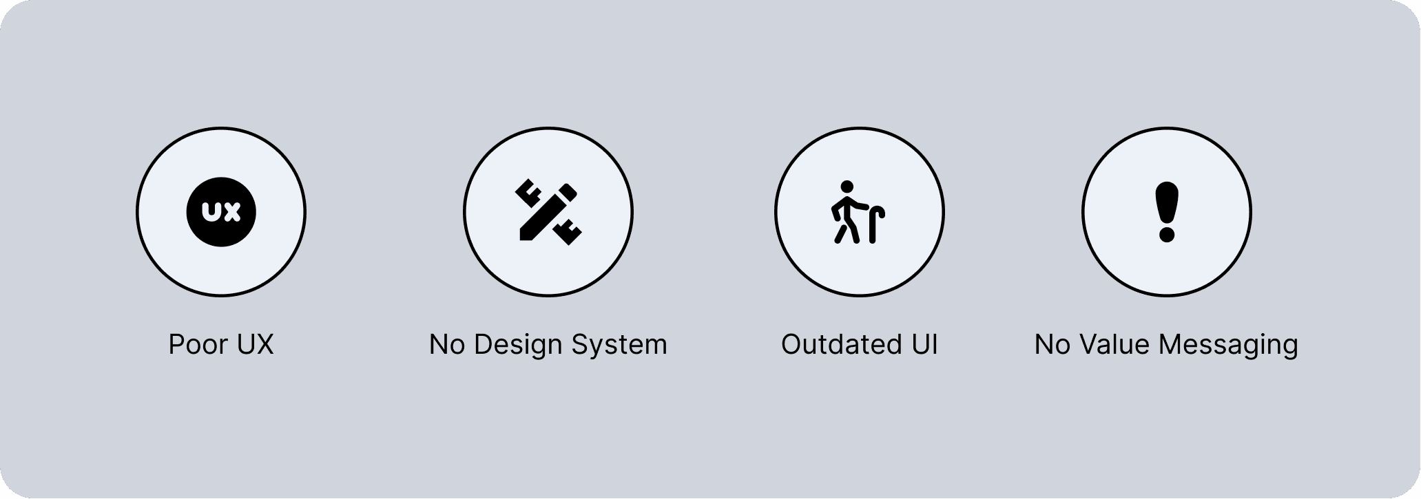
Our audit of the existing website surfaced several major issues:
Poor UX: Users found it hard to understand what Netcoins offered or how to get started. CTAs were inconsistent, and key benefits were buried.
No component system or design consistency: The lack of reusable components made scaling content slow and error-prone, especially for marketing updates.
Outdated visuals undermined trust: The visual identity lacked cohesion and didn’t reflect the credibility expected in the crypto space.
Unclear value messaging across the site: The website lacked a strong narrative or messaging hierarchy. It was unclear who Netcoins was for, what set it apart from competitors, or why users should take action.
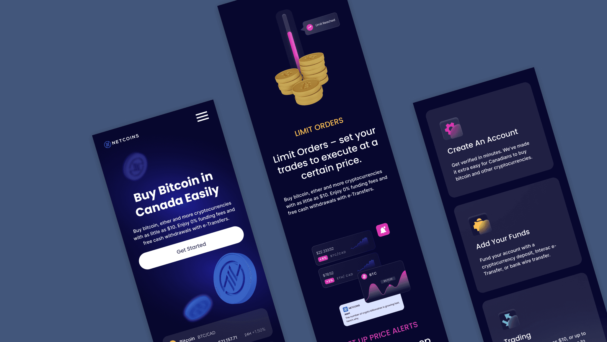
Old UI
New Modular CMS Design Blocks
Audit & Findings
After the audit, we distilled 4 majors of improvement.
Solutions
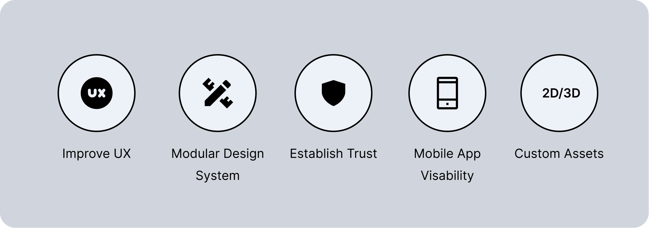
Improved UX & Site Structure
We reworked the site architecture for clarity and focus. Pages were reorganized around key user goals, and CTAs were placed with consistent styling and purpose.
Modular Component-Based Design System
We built a responsive design system in Figma, complete with reusable components for layout, navigation, content blocks, and CTAs. The system was built to support responsive behavior, white-labeling needs, and visual consistency across the site.
Refined Visual Language for Trust
We evolved Netcoins’ visual identity with a more modern and trustworthy aesthetic. This included refining the color palette, typography and layout grids.
Mobile App Visibility and Promotion
To increase mobile app adoption, we embedded app-specific messaging throughout key flows, added persistent download CTAs, and made the app a visible part of the broader product experience.
Custom Assets (2D.3D) for Website and Social Media
We introduced a set of custom 3D illustrations and icons, tailored for social media and campaign usage. These assets reinforced the updated brand tone—modern, accessible, and trustworthy—while giving the marketing team flexible tools to elevate their content.
Navigating The Crypto Crisis
Midway through the project, the crypto crash triggered a drop in user trust. We quickly validated new concerns and added trust-focused UX updates—like reviews and live chat—even though a full brand overhaul wasn’t possible.
Testing/Validation
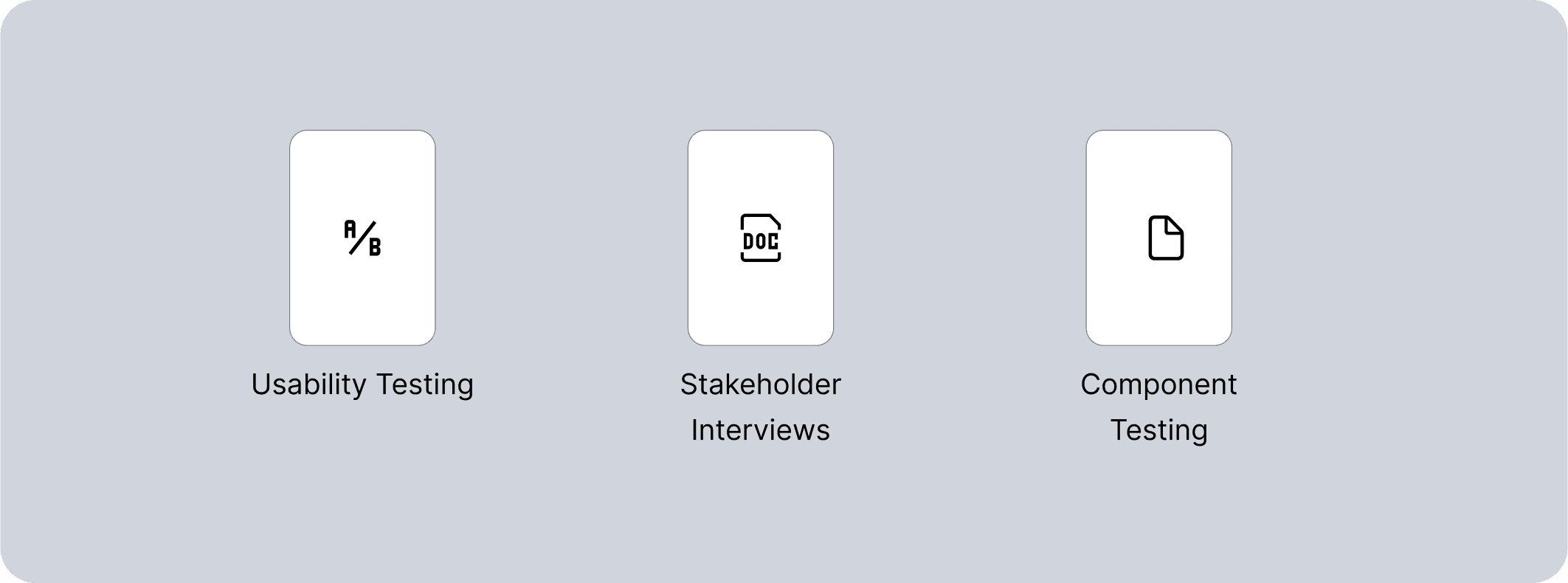
To ensure the redesign was user-centered and effective, we tested design prototypes throughout the project using three key methods:
Solutions
Validation
Once testing confirmed the UX and design direction, we validated key decisions through a combination of user reactions and early behavioral data. During handoff and staging, internal teams and selected users shared feedback on flow clarity, content comprehension, and conversion readiness.
Validation confirmed
- Users found the redesigned flows easier to navigate
- The new messaging better communicated Netcoins’ value proposition (Mobile App CTA Push)
- The modular system worked as intended across breakpoints and use cases
Types
To ensure the redesign was user-centered and effective, we tested design prototypes throughout the project using three key methods:
Usability Testing
We conducted moderated tests with new and existing users using mid- to high-fidelity prototypes. Tasks focused on navigation, key flows, and messaging clarity.
Stakeholder Interviews
Cross-functional reviews with internal teams—especially marketing and support—gave us insight into real-world user pain points.
Developer QA & Component Testing
To avoid design/development misalignment, we worked closely with engineering to test how our Figma components performed in code.
Project Breakdown
Final High Res Testing
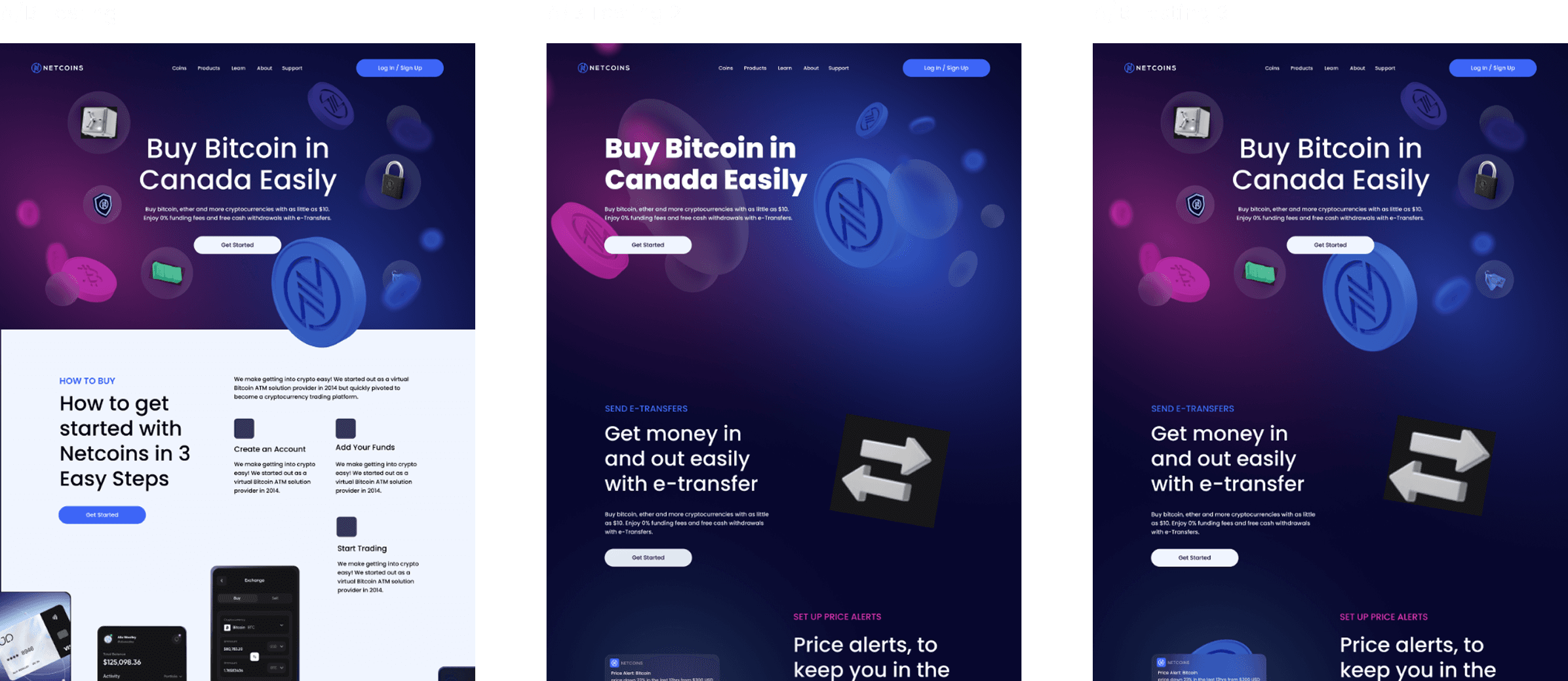
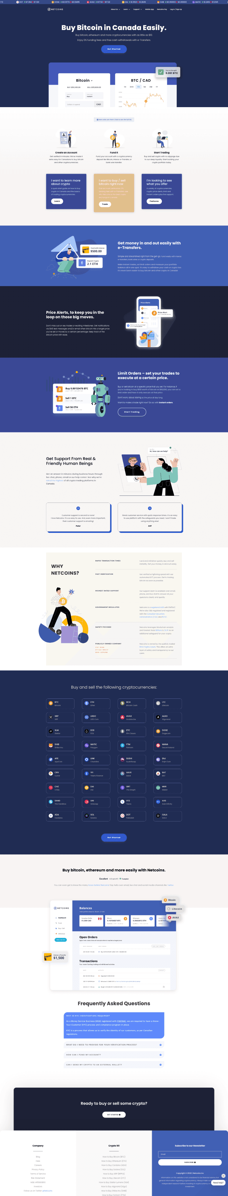
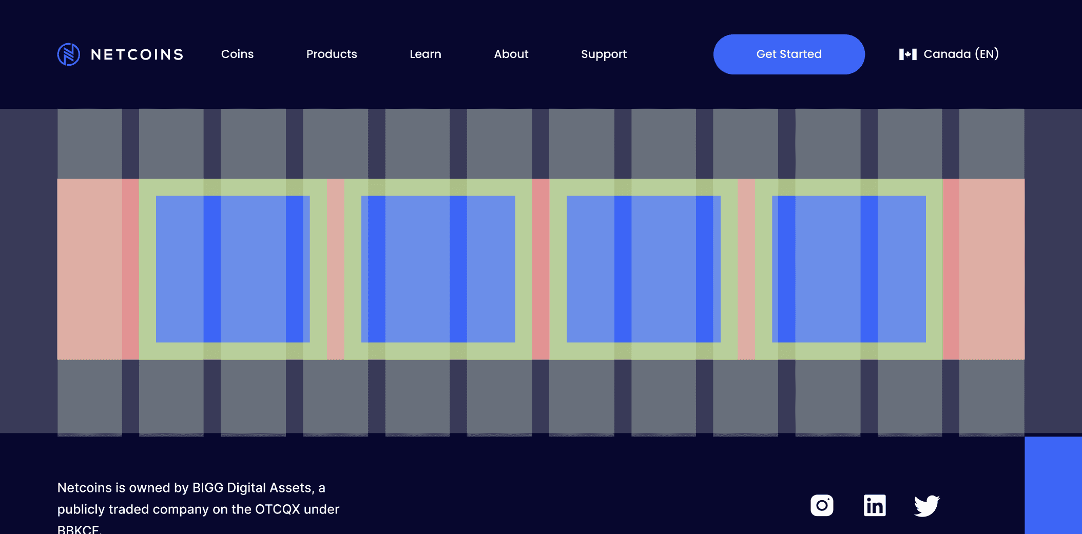
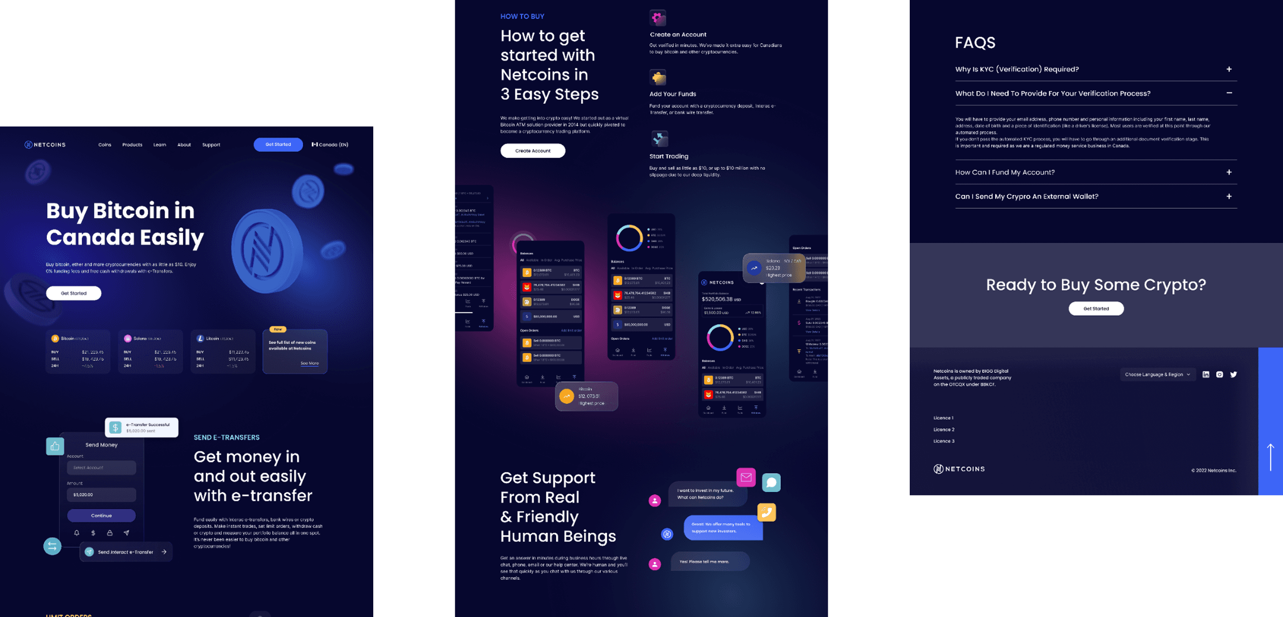
Final Layout (Homepage Example)
Background
Netcoins, a Canadian cryptocurrency trading platform, was in the middle of a major brand and website redesign when the broader crypto market experienced a sharp downturn. As user trust in crypto platforms plummeted, our design strategy had to adapt—shifting from bold, Web3-forward messaging to trust-focused UX enhancements. Initially, the goal was to modernize the brand, improve the user experience, and build a flexible design system for future scalability. But as the crypto crisis unfolded mid-project, our team recognized the urgent need to revalidate our approach. The final product struck a balance between our original goals and the shifting needs of users in a suddenly volatile market.
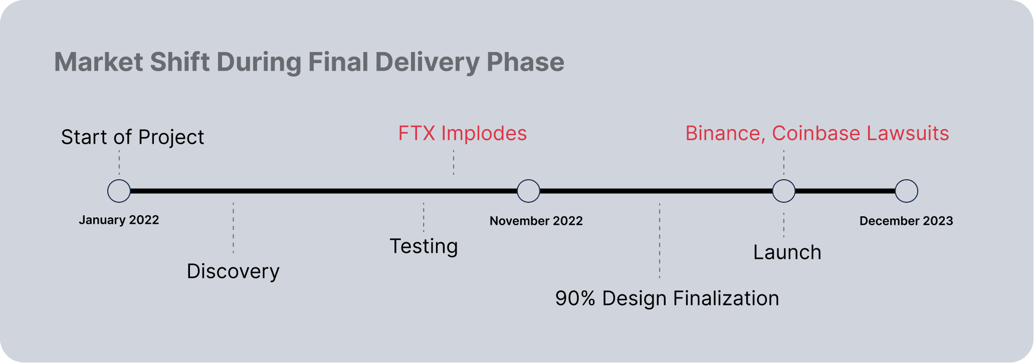
Context
As we approached the final stages of the Netcoins redesign, the broader crypto industry faced a major disruption. High-profile collapses (like FTX), regulatory crackdowns, and media backlash triggered a sharp decline in public trust toward crypto platforms.
Up to this point, our work had leaned into the prevailing Web3 branding tone—cutting-edge, futuristic, and aspirational. This approach echoed what users had come to expect from crypto: bold visuals, high-risk language, and forward momentum (think Matt Damon in space marketing fortune through bravery).
But post-crisis, that narrative no longer worked. New and returning users weren’t looking for excitement—they were seeking security, credibility, and support.
Playbook
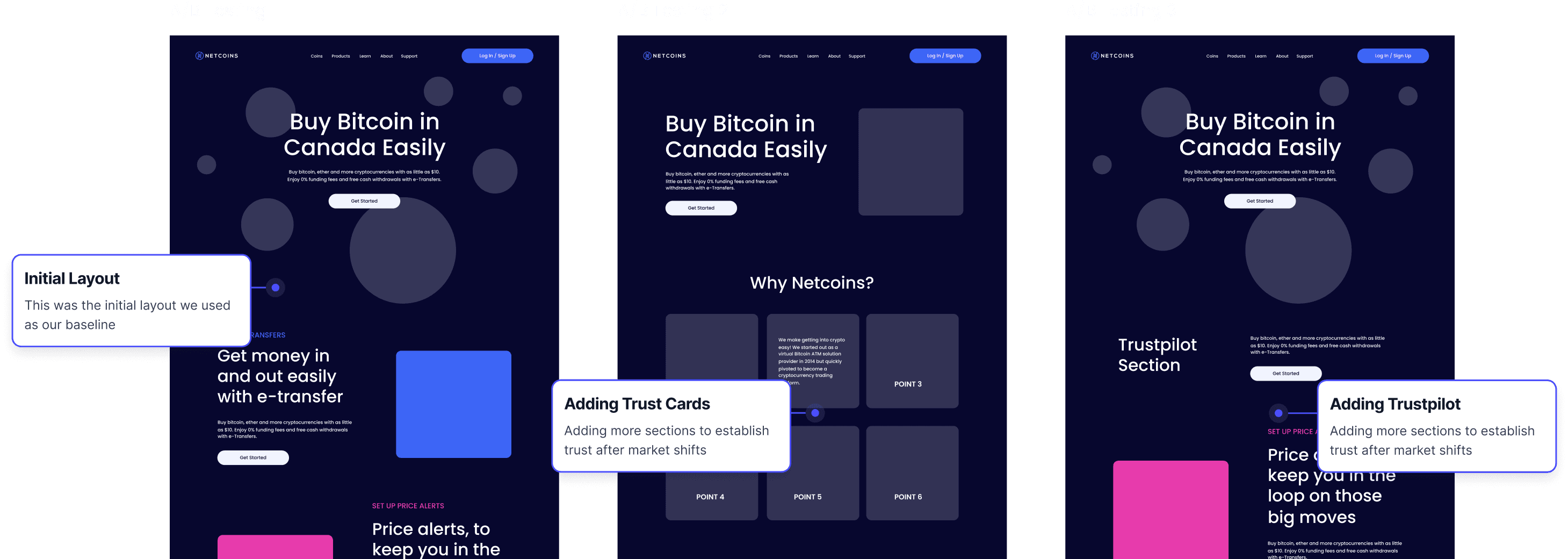
Although we had completed about 90% of the design work, we paused to conduct a second round of user validation. The research confirmed what we suspected: there was a significant drop in consumer trust, especially among crypto newcomers.
We weren’t in a position to rework the entire brand or visual direction, but we adapted the UX strategy to reinforce credibility where possible:
Trust-Focused Enhancements
Added Trustpilot reviews prominently on the homepage and pricing pages to surface third-party credibility signals.
Elevated Live Chat Visibility
Across key touchpoints to promote a human connection and real-time support.
Adjusted Tone
Product messaging to highlight security, Canadian regulation compliance, and long-term platform stability.
Lessons
This pivot reinforced a key principle: design isn’t static—it must respond to real-world shifts. While we couldn’t rebrand the entire system, we adapted what we could to meet users where they were—cautious, skeptical, and looking for reassurance.
In volatile industries like crypto, success isn’t just about building beautiful systems—it’s about building trust that can weather uncertainty.
Results
The redesign led to a 12% increase in mobile app downloads, improved user trust and navigation, and cut development time by 30%. Social growth was modest, highlighting the need for stronger alignment between brand and content strategy.
Results
The redesign led to a 12% increase in mobile app downloads, improved user trust and navigation, and cut development time by 30%. Social growth was modest, highlighting the need for stronger alignment between brand and content strategy.
New Layout Testing
Increased Mobile App Downloads
Following the redesign, Netcoins saw a 12% increase in mobile app downloads over three months. Clearer CTAs, better placement, and integrated messaging throughout the site made the app more visible and appealing to users.
Faster Development and Page Creation
With a new modular design system in place, the Netcoins team was able to reduce development time for new features and pages by 30%. This allowed for quicker campaign launches and more agility in updating site content.
Improved Trust and Brand Perception
Users responded positively to the updated visual identity, describing the new site as more professional, trustworthy, and aligned with financial expectations. The refreshed design helped position Netcoins as a credible player in a highly competitive space.
Modest Social Growth
While the redesigned visuals and 3D assets elevated the brand’s presence, Instagram follower growth remained modest at 5% over six months. This highlighted the need for deeper strategy alignment between web, brand, and social content—an area identified for future improvement.
Goal
My role focused on refining the visual identity, auditing the user experience, contributing to the creation of a modular component system, and ensuring consistency across breakpoints and platforms. I worked cross-functionally with marketing, product, and engineering teams to bring this redesign to life.
Role
My role focused on refining the visual identity, auditing the user experience, contributing to the creation of a modular component system, and ensuring consistency across breakpoints and platforms. I worked cross-functionally with marketing, product, and engineering teams to bring this redesign to life.
Audit & Findings
Audit & Findings
After the audit, we distilled 4 majors of improvement.
Major Findings
Section Title
Section Title
Our audit of the existing website surfaced several major issues:
Poor UX: Users found it hard to understand what Netcoins offered or how to get started. CTAs were inconsistent, and key benefits were buried.
No component system or design consistency: The lack of reusable components made scaling content slow and error-prone, especially for marketing updates.
Outdated visuals undermined trust: The visual identity lacked cohesion and didn’t reflect the credibility expected in the crypto space.
Unclear value messaging across the site: The website lacked a strong narrative or messaging hierarchy. It was unclear who Netcoins was for, what set it apart from competitors, or why users should take action.
Old UI
Major Findings
Our audit of the existing website surfaced several major issues: Poor UX clarity and flow: Users found it hard to understand what Netcoins offered or how to get started. CTAs were inconsistent, and key benefits were buried. No component system or design consistency: The lack of reusable components made scaling content slow and error-prone, especially for marketing updates. Outdated visuals undermined trust: The visual identity lacked cohesion and didn’t reflect the credibility expected in the crypto space. Unclear value messaging across the site: The website lacked a strong narrative or messaging hierarchy. It was unclear who Netcoins was for, what set it apart from competitors, or why users should take action. Key differentiators and product benefits weren’t communicated clearly, which limited both engagement and conversion.
Solutions
Solutions
Solutions
Section Title
Section Title
Improved UX & Site Structure
We reworked the site architecture for clarity and focus. Pages were reorganized around key user goals, and CTAs were placed with consistent styling and purpose.
Modular Component-Based Design System
We built a responsive design system in Figma, complete with reusable components for layout, navigation, content blocks, and CTAs. The system was built to support responsive behavior, white-labeling needs, and visual consistency across the site.
Refined Visual Language for Trust
We evolved Netcoins’ visual identity with a more modern and trustworthy aesthetic. This included refining the color palette, typography and layout grids.
Mobile App Visibility and Promotion
To increase mobile app adoption, we embedded app-specific messaging throughout key flows, added persistent download CTAs, and made the app a visible part of the broader product experience.
Custom Assets (2D.3D) for Website and Social Media
We introduced a set of custom 3D illustrations and icons, tailored for social media and campaign usage. These assets reinforced the updated brand tone—modern, accessible, and trustworthy—while giving the marketing team flexible tools to elevate their content.
Testing/Validation
To ensure the redesign was user-centered and effective, we tested design prototypes throughout the project using three key methods:
New Modular CMS Design Blocks
Navigating The Crypto Crisis
Midway through the project, the crypto crash triggered a drop in user trust. We quickly validated new concerns and added trust-focused UX updates—like reviews and live chat—even though a full brand overhaul wasn’t possible.
New Modular CMS Design Blocks
Testing/Validation
To ensure the redesign was user-centered and effective, we tested design prototypes throughout the project using three key methods:
New Layout Testing
Types
Types
Types
To ensure the redesign was user-centered and effective, we tested design prototypes throughout the project using three key methods:
Usability Testing
We conducted moderated tests with new and existing users using mid- to high-fidelity prototypes. Tasks focused on navigation, key flows, and messaging clarity.
Stakeholder Interviews
Cross-functional reviews with internal teams—especially marketing and support—gave us insight into real-world user pain points.
Developer QA & Component Testing
To avoid design/development misalignment, we worked closely with engineering to test how our Figma components performed in code.
Validation
Validation
Validation
Once testing confirmed the UX and design direction, we validated key decisions through a combination of user reactions and early behavioral data. During handoff and staging, internal teams and selected users shared feedback on flow clarity, content comprehension, and conversion readiness.
Validation confirmed
- Users found the redesigned flows easier to navigate
- The new messaging better communicated Netcoins’ value proposition (Mobile App CTA Push)
- The modular system worked as intended across breakpoints and use cases
Final High Res Testing
Navigating The Crypto Crisis
Midway through the project, the crypto crash triggered a drop in user trust. We quickly validated new concerns and added trust-focused UX updates—like reviews and live chat—even though a full brand overhaul wasn’t possible.
Context
As we approached the final stages of the Netcoins redesign, the broader crypto industry faced a major disruption. High-profile collapses (like FTX), regulatory crackdowns, and media backlash triggered a sharp decline in public trust toward crypto platforms.
Up to this point, our work had leaned into the prevailing Web3 branding tone—cutting-edge, futuristic, and aspirational. This approach echoed what users had come to expect from crypto: bold visuals, high-risk language, and forward momentum (think Matt Damon in space marketing fortune through bravery).
But post-crisis, that narrative no longer worked. New and returning users weren’t looking for excitement—they were seeking security, credibility, and support.
Playbook
Although we had completed about 90% of the design work, we paused to conduct a second round of user validation. The research confirmed what we suspected: there was a significant drop in consumer trust, especially among crypto newcomers.
We weren’t in a position to rework the entire brand or visual direction, but we adapted the UX strategy to reinforce credibility where possible:
Trust-Focused Enhancements
Added Trustpilot reviews prominently on the homepage and pricing pages to surface third-party credibility signals.
Elevated Live Chat Visibility
Across key touchpoints to promote a human connection and real-time support.
Adjusted Tone
Product messaging to highlight security, Canadian regulation compliance, and long-term platform stability.
Lessons
This pivot reinforced a key principle: design isn’t static—it must respond to real-world shifts. While we couldn’t rebrand the entire system, we adapted what we could to meet users where they were—cautious, skeptical, and looking for reassurance.
In volatile industries like crypto, success isn’t just about building beautiful systems—it’s about building trust that can weather uncertainty.
New Layout Testing
Results
The redesign led to a 12% increase in mobile app downloads, improved user trust and navigation, and cut development time by 30%. Social growth was modest, highlighting the need for stronger alignment between brand and content strategy.
Results
The redesign led to a 12% increase in mobile app downloads, improved user trust and navigation, and cut development time by 30%. Social growth was modest, highlighting the need for stronger alignment between brand and content strategy.
Results
The redesign led to a 12% increase in mobile app downloads, improved user trust and navigation, and cut development time by 30%. Social growth was modest, highlighting the need for stronger alignment between brand and content strategy.
Increased Mobile App Downloads
Following the redesign, Netcoins saw a 12% increase in mobile app downloads over three months. Clearer CTAs, better placement, and integrated messaging throughout the site made the app more visible and appealing to users.
Faster Development and Page Creation
With a new modular design system in place, the Netcoins team was able to reduce development time for new features and pages by 30%. This allowed for quicker campaign launches and more agility in updating site content.
Improved Trust and Brand Perception
Users responded positively to the updated visual identity, describing the new site as more professional, trustworthy, and aligned with financial expectations. The refreshed design helped position Netcoins as a credible player in a highly competitive space.
Modest Social Growth
While the redesigned visuals and 3D assets elevated the brand’s presence, Instagram follower growth remained modest at 5% over six months. This highlighted the need for deeper strategy alignment between web, brand, and social content—an area identified for future improvement.
Final Layout (Homepage Example)
Let’s Connect
I believe design can create change. I’m driven by the challenge of turning ideas into impactful products that create results.
Email Me
Let’s Connect
I believe design can create change. I’m driven by the challenge of turning ideas into impactful products that create results.
Email Me
Let’s Connect
I believe design can create change. I’m driven by the challenge of turning ideas into impactful products that create results.
Email Me
Let’s Connect
I believe design can create change. I’m driven by the challenge of turning ideas into impactful products that create results.
Email Me
eeisenstadt@gmail.com
eeisenstadt
@gmail.com