Client
Grata
Role
Product Designer
Date
June 2024 - current
Project Breakdown
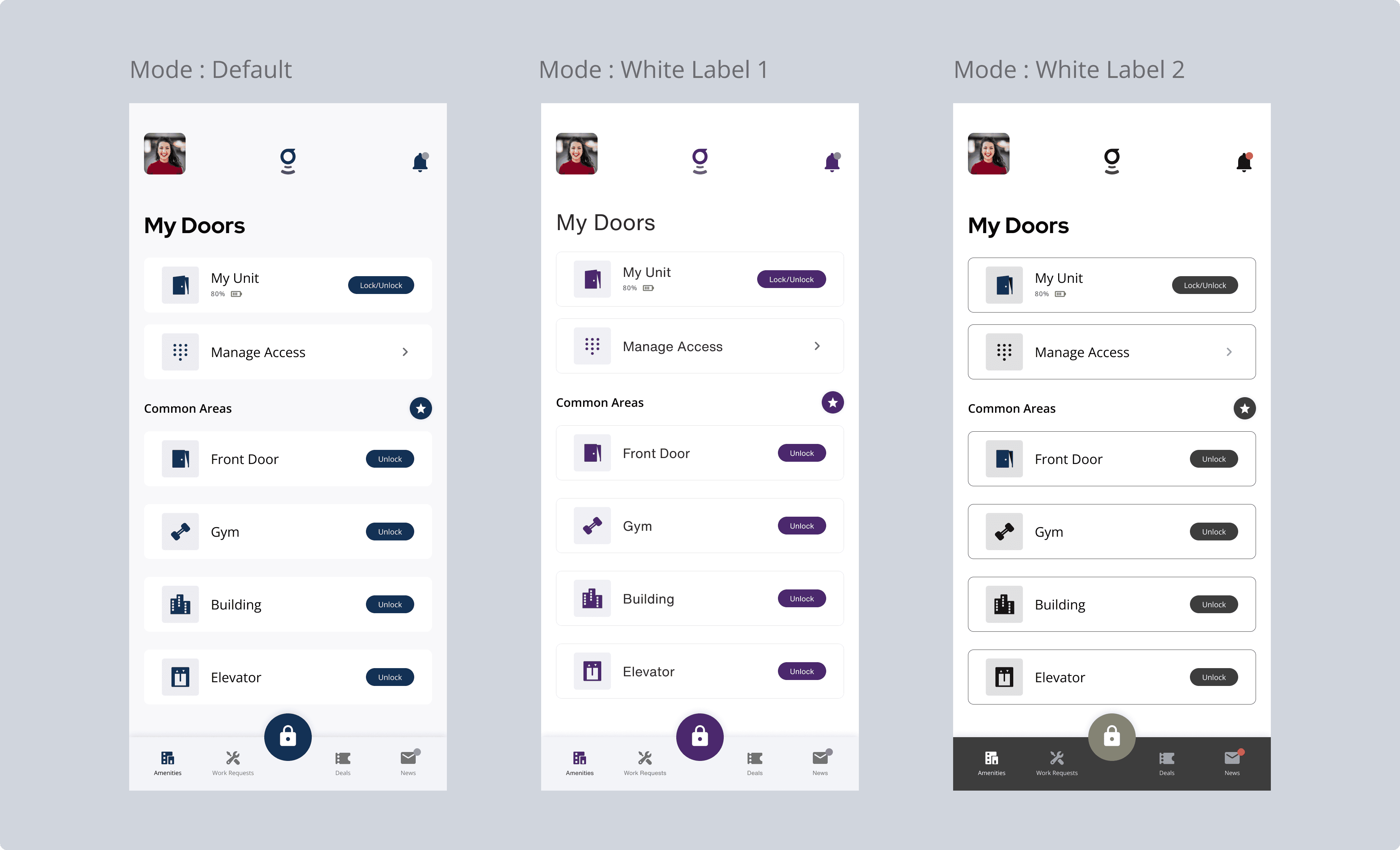
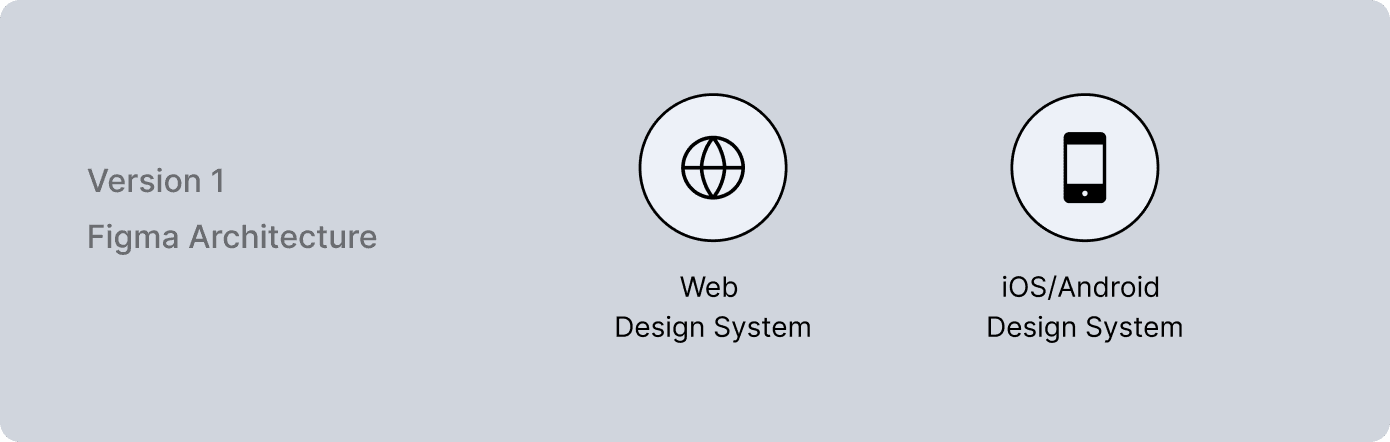
Grata is a Smart Living Operating System used by residents, property managers, and operators across dozens of buildings—each with unique branding requirements. As we expanded to serve more clients, it became clear we needed a white-label-ready design system that could scale across three platforms: Web App, Resident Mobile App (iOS/Android), and Manager App (iOS).
I led the design of a token-based system that allowed core UI and UX patterns to remain consistent, while enabling each client (building or property group) to apply their own colors, logos, and light brand theming without breaking usability or development flow.
Each client wanted a unique visual identity—custom logos, brand colors, and occasionally, custom fonts. But our UI was hardcoded with fixed styles across products, and what began as a few overrides quickly snowballed into fragile, inconsistent themes that created more bugs than value. To make matters more complex, we were juggling two separate design systems—one for Web and another loosely maintained for Mobile—resulting in duplicated efforts, misaligned components, and no clear source of truth.
Our goal was to create a centralized, token-based design system that could serve as the backbone for all Grata apps, while allowing for lightweight, brand-specific customization - white labelling clients.
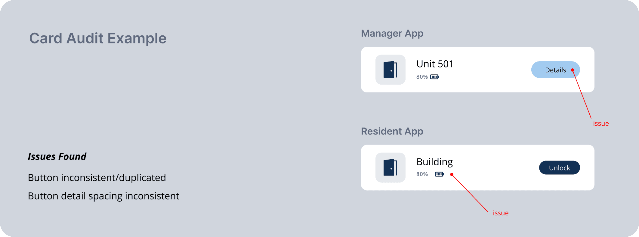
Audit
Inconsistent Systems Across Platforms
We began with a full audit of our design libraries in Figma and the live product codebases in React. It quickly became clear that each platform had its own loosely maintained design logic, with no shared foundation.
Redundancy & Drift in Code and Design
Some components like buttons had over six distinct visual styles depending on the platform. Spacing, color, and text styles weren’t standardized.
Poor Structure
Structure was missing. There was no unified token system, no shared naming convention, and no clear component logic guiding the system across platforms.
Foundations
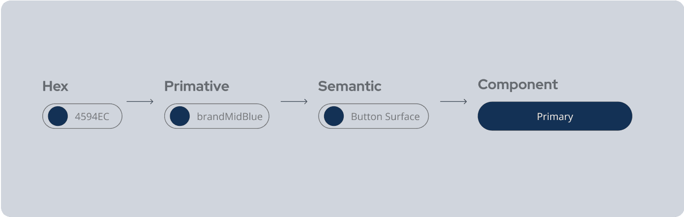
Neutral Design Tokens for Theming
We restructured our visual language using Figma’s new token features. By creating design primitives like color-bg-primary or spacing-md, we decoupled branding from logic. This allowed us to apply different visual themes (per client) without altering the structure of components or rewriting styles.
Responsive Grids and Scalable Layouts
To ensure consistency across platforms and devices, we created adaptive grid systems tailored for both Web and Mobile. These layouts respected platform conventions and supported responsiveness across breakpoints—from small devices to large admin dashboards.
Atomic Design
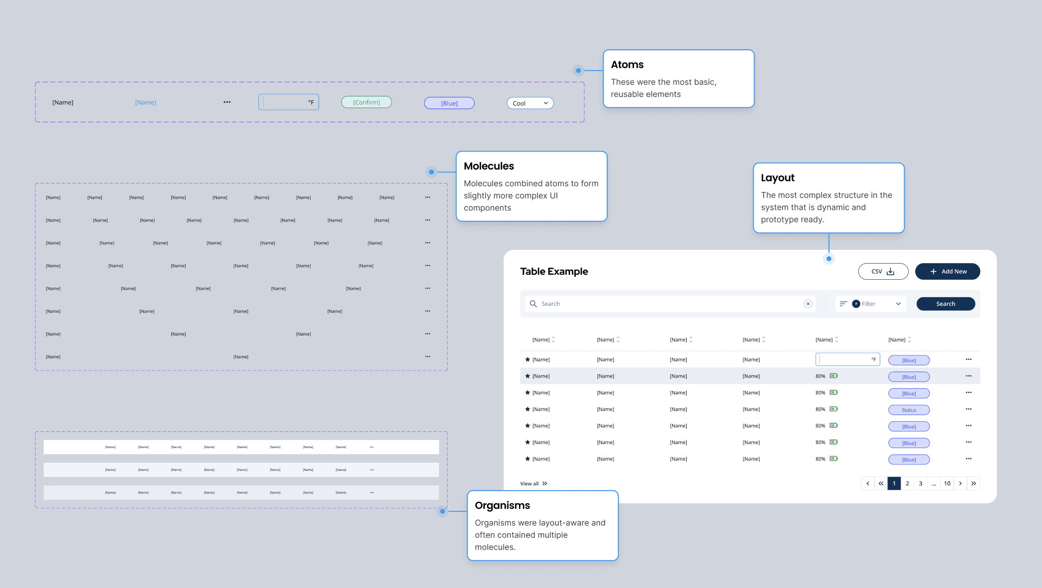
Organizing UI by Complexity
We structured our component library around Atomic Design principles: atoms (e.g., icons, buttons), molecules (e.g., input fields, navigation items), and organisms (e.g., modals, headers). This gave us a scalable model for organizing UI logic and understanding when to reuse versus rebuild.
Scalability
This structure reduced redundancy and enabled us to scale faster across platforms. It helped teams think in terms of component relationships and made onboarding easier. It also aligned with the mental models of engineers, especially those working in component-based frameworks like React.
Build Scalable Components
Token-Based, Variant-Driven Components
We rebuilt our component library using Figma variants and token logic. Core components like buttons, forms, and alerts were built to be flexible, supporting variations like size, icon position, and state—without creating new versions of the same thing.
Token Distribution Across Platforms
To streamline implementation and ensure consistency, we created a centralized Design System Library in Figma containing all core design tokens—colors, typography, spacing, border radius, and shadows. From there, we imported the token set into platform-specific Figma files.
iOS / Android Figma
Tokens were mapped to native UI patterns while preserving platform conventions. This allowed mobile designers to use shared values while still designing within native constraints.
Web Portal
A separate Web-specific Figma file was linked to the core library. This ensured Admin design maintained brand alignment while supporting layout patterns unique to web (like sidebars, tables, and dashboards).
Brand Styling via Overrides
Thanks to the token-based structure, we were able to apply client-specific branding by simply overriding tokens. Components could be re-skinned based on brand rules without touching their internal logic—supporting white-labeling at scale.
Documentation & Accessibility
Centralized System Hub in Figma & Notion
All documentation was consolidated into a centralized hub across Figma and Notion. This included component usage rules, links to code references, and embedded Storybook previews—making it easy for developers and designers to align.
Accessibility Is Important
We integrated accessibility principles directly into our documentation: contrast requirements, tap targets, keyboard navigation, and motion standards were all clearly defined.
White-Label Guidelines
To support client theming, we documented customization and minimum requirements (e.g., contrast ratios, logo dimensions). This ensured that even when brands changed, usability and compliance remained intact.
Dev Ready
“Ready for Dev” in Figma
As components became stable, we tagged them “Ready for Dev” in Figma. This made it clear which components were fully specced and safe to implement.
Token-to-Code Integration Pipeline
We set up a direct pipeline from Figma to code. Tokens created in Figma were translated into consumable design tokens in React and SwiftUI.
Test, Validate & Governance
Real-World Testing
After launch, we monitored how components performed in real-world usage—across tenant brands, devices, and platforms. We ran accessibility tests to validate compliance and made adjustments based on usability testing and stakeholder input.
Long-Term Governance
To ensure sustainability, we created a lightweight versioning system and maintenance calendar. This allowed us to roll out updates in a controlled way without disrupting in-progress work or breaking dependent features.
With shared tokens and a single source of truth, engineers were able to implement UI faster and with fewer handoffs. The time required to build new screens dropped by an estimated 20%, particularly for recurring flows.
The token-based theming system enabled us to roll out branded experiences for new buildings or clients in a fraction of the time. What once took custom overrides now took a few configuration changes. New clients could be fully themed in under 2 days, without disrupting the core product logic.
Component reuse in Figma and production code grew significantly. Our analytics showed a 40% reduction in duplicate components.
While I can’t name white-label clients due to confidentiality, we’ve landed two large white-label partnerships this year—in part due to an aggressive sales strategy supported by interactive prototypes.